Designing a better home for writing, part 1
This blog experienced a lull from 2014-07-07 to 2017-02-27, some 966 days. A lot happened in that timespan - I went through a long period of therapy, spent awhile reverse-engineering Dig data from dead ESRI databases in an Archaeology department, and got into everything from Swing Dancing to Python.
What didn’t change was that the old design, well, sucked. I don’t mean that it was the worst thing ever, but it was underwhelming as a place to write. So I’m going to talk through the redesign process.
I’m not a UI designer, but I have a pretty good grasp of UX from working at a web agency and a consumer-focused startup. I think this showed: this design was perfectly functional, links were quite visible, and the important text stood out. But the UI was very LaTeXy-monochrome, perhaps a reflection of how I was feeling when I made it.
When I started writing again I was nervous about how well I could write. I am not a naturally talented writer. But as with many skills worth learning, you just need to practice it enough that it becomes second nature. As I get more used to writing my writing should improve. I might build an audience of Rustaceans. My writing elsewhere should become clearer and easier. But part of this is having a pleasing place to write.
Redesign narrative
I need some fonts
As someone who dabbles in frontend and hasn’t done intense JavaScript work since 2013, one of the brilliant things of 201x is webfonts. Being able to pick out pleasant fonts that suit your design is so much more powerful than relying on the client computer to have nice fonts. In my teens it was common to embed nicely-fonted text as images, with the actual text text-indent: -9999px; out the way.
At one point I had a paid Typekit subscription, but more recently Google Fonts offers free and liberally licensed fonts. Rather than being second-best, many or all of them are very high quality. Some seem curiously similar to hyper-expensive fonts I used in days gone by, on which I’ve no comment.
Anyhow. I rather liked a Serif font in use by Michael Walker (also of York Comp Sci), Merriweather, so I picked that. At some point during the process I also recruited Open Sans which is the font you’re reading right now.
I need some colours
From past experience it helps me to get an initial colour palette. Many experienced designers seem to design in grayscale and treat the colours as second to content. However I find I can struggle with how to colorize a design and make it ‘pop.’ The content was largely already present - I wanted to stick with hakyll, a Haskell static site generator, and I didn’t want to make major content alterations.
I’ve always liked maroony reds, so that was my startpoint. Ten minutes of Adobe Kuler later, I had this:

The intensity of the cyans was concerning, but that was something to try and see. In practice the cyans are barely used, with a bright yellow and a deep blue instead. But the three, intense reds are the key to the design.
First sketch
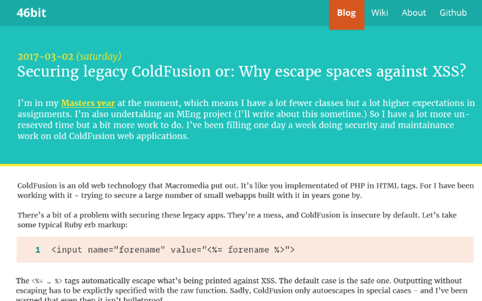
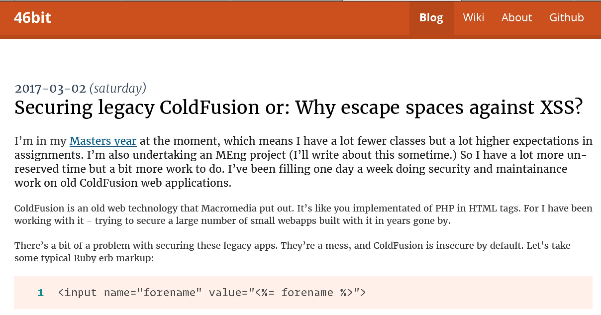
I chose to use my Securing legacy ColdFusion or: Why escape spaces against XSS? post as the content for the redesign. It isn’t my best post ever, but the mix of text and code is quite representative of what I’ll be writing here.
A half hour in this is looking quite effective. The navigation colours don’t work, the logo text is too heavy, but the basic structure works.
Fourth sketch
Out of necessity I’m jumping ahead a way.
At this point I’d copied in more content. This seemed essential in understanding how a long post would perform. I’ve previously found that simple designs with the header out of sight can be monochrome.
Sixth sketch
As someone who does a lot of business with the US and rest-of-the-world, I’m quite a fan of the YYYY-MM-DD date format. But here I started experimenting with including the day of the week, and in the final design I concluded a ‘human’ format would surprise users less.
Eleventh sketch
I tried to bring in more colours from the colourscheme, building a big header. This does sort-of work - but so much cyan is a risk when it comes to flexibility later.
Eighteenth sketch
I tried dropping the header and adding a bar below the navigation to enhance the structural connection to the active navigation item. This seemed like a great idea.
Nineteenth sketch, the final one

Inspired, I brought the reds and the more active navigation together. I loved it and decided this was enough to start implementing. Further changes could be made in the browser.
A logo revived

In 2010 I hired Anthony Bullock to build me a much nicer freelance portfolio than what I had been using. The aim was to get more work from a more pleasing internet presence, and I think it was successful. I was 16 at the time.
I noticed the above designs could do with a nice logo. So I opened up my old one, that Anthony designed. I lightened some text, changed the hue of the “bit,” and played with the correct size. And it works nicely! Thanks again, Anthony.
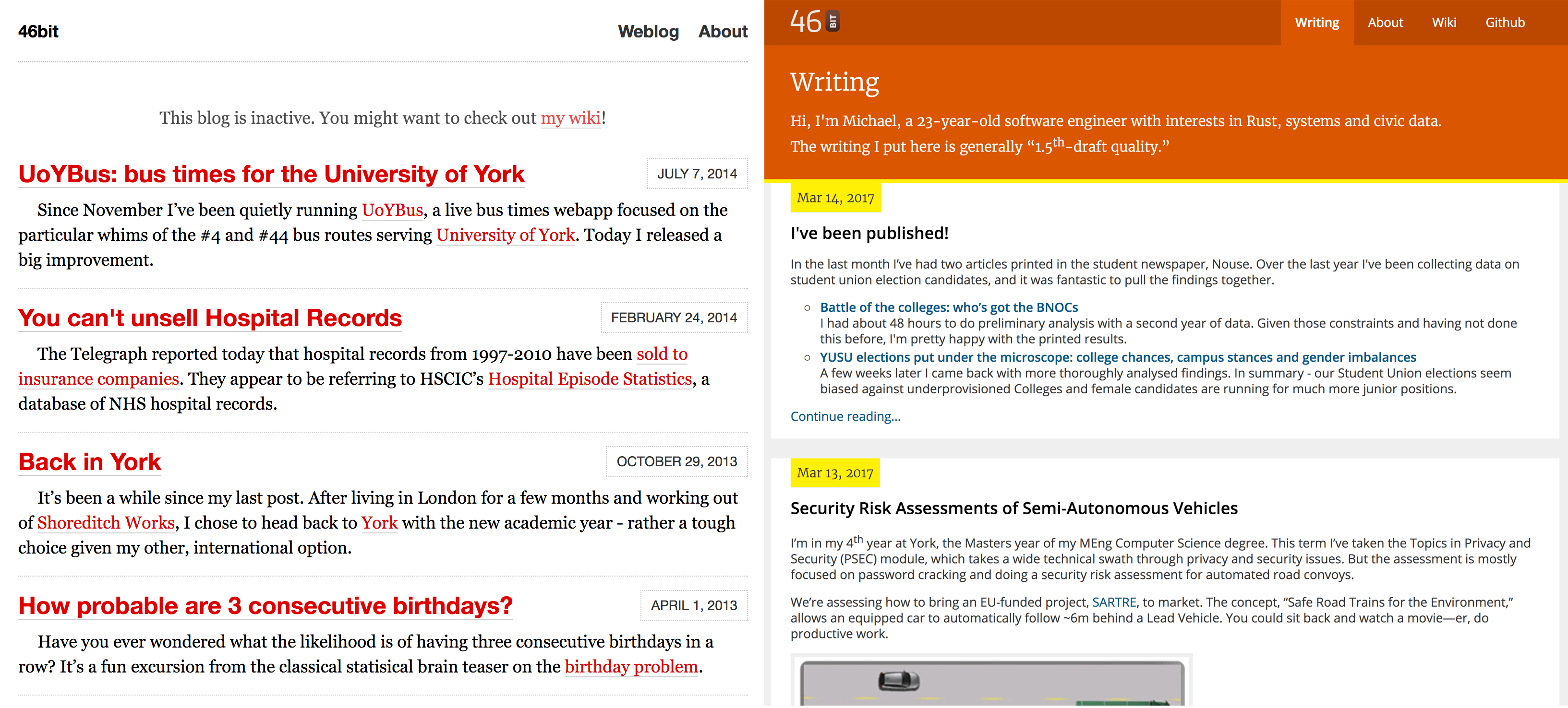
What’s live now
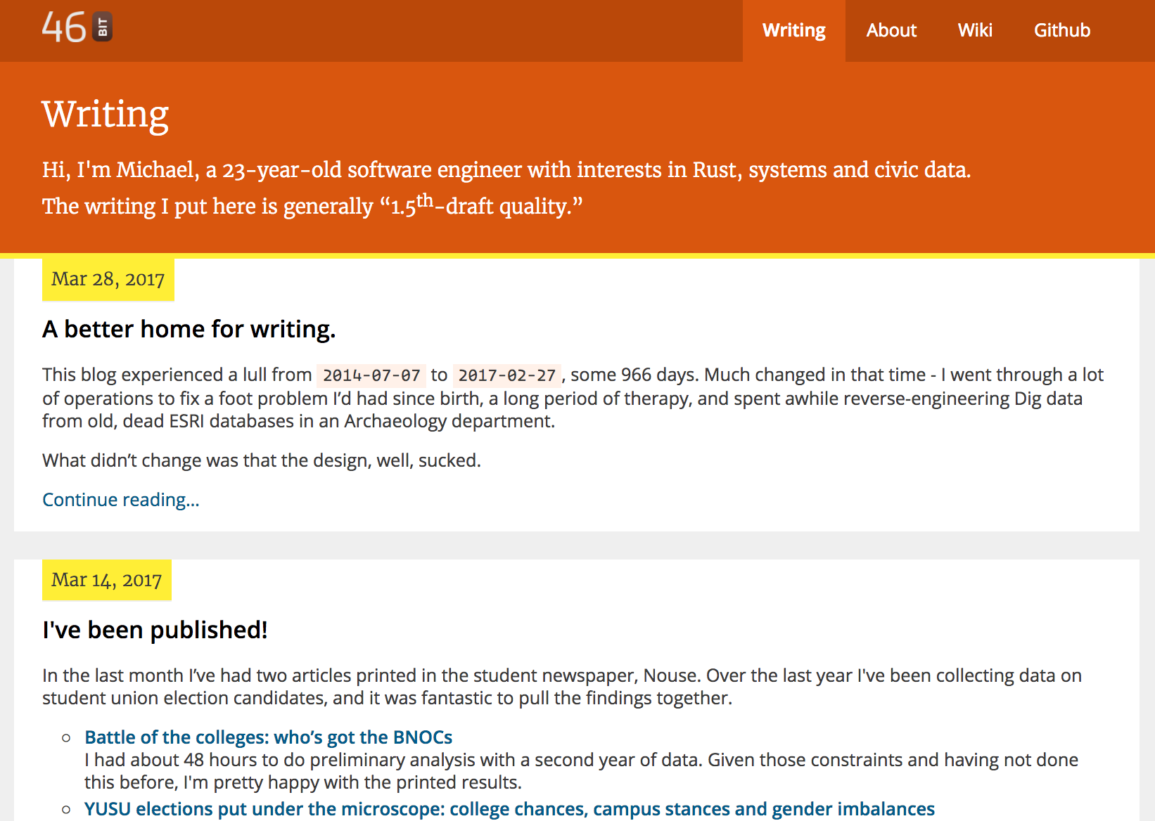
You might notice - the narrow yellow line below the title bar originated in Sketch 11. It isn’t in the colourscheme at all; I picked it up by chance. But it has made it into the live design, dividing the title bar and the post date on pages that list posts. It was on other pages for a while, but it split up the title and the text too much - the Achilles Heel of this design.
As of last night I’ve built in mobile support. Something I haven’t done with this design is use Flexbox - I’m still using floats for positioning the logo and navigation. I’ve my MEng project to do and am under a lot of time pressure, so it was the wrong time to learn that.
There is still a long way to go, but this is a design that can grow easily.